Case Study · Design System Leadership

Building an enterprise design system that six teams actually used.

How I led design-system ownership at Momentive Software (formerly Community Brands) — from token foundation and accessible components to the cross-team adoption that cut design-to-development handoff by 40%.

Role
Principal UX Lead — system owner
Product
GiveSmart Fundraise · Momentive
Adoption
6 product teams
Outcome
40% faster design-to-dev handoff

Attribution. All screenshots and tokens shown on this page are from the design system I led at Momentive Software (formerly Community Brands). Shown with credit to the GiveSmart Fundraise team. Product-specific context has been cropped; the underlying patterns and decisions are the work of the design organization I led.

01 · The problem

Six teams. Same components, rebuilt every time.

When a product spans six teams, the cost of a missing design system isn't a style debate — it's a tax on every release. Buttons drifted. Form states disagreed. Accessibility was inconsistent. Each handoff started with a re-litigation of decisions that had already been made elsewhere in the platform.

That compounding interest of design debt was slowing both engineering and design — and at the customer-facing surface, it was eroding the calm, trustworthy feel a fundraising platform needs. The right intervention wasn't another component library; it was a system the teams would adopt without being mandated to.

02 · My role

End-to-end ownership — strategy, system, adoption.

As Principal UX Lead I owned the system end-to-end: defining the token foundation, designing the component layer, writing the governance model, and — the part most systems fail on — leading the cross-team adoption alongside engineering leads and product managers in each of the six teams. Adoption was the deliverable, not the components.

03 · Token foundation

Tokens as the contract between design and engineering.

Before any component existed, the colour, spacing, elevation, and radius decisions were defined as CSS variables with semantic names — so the system could be discussed in the same vocabulary in Figma, in Storybook, and in production code.
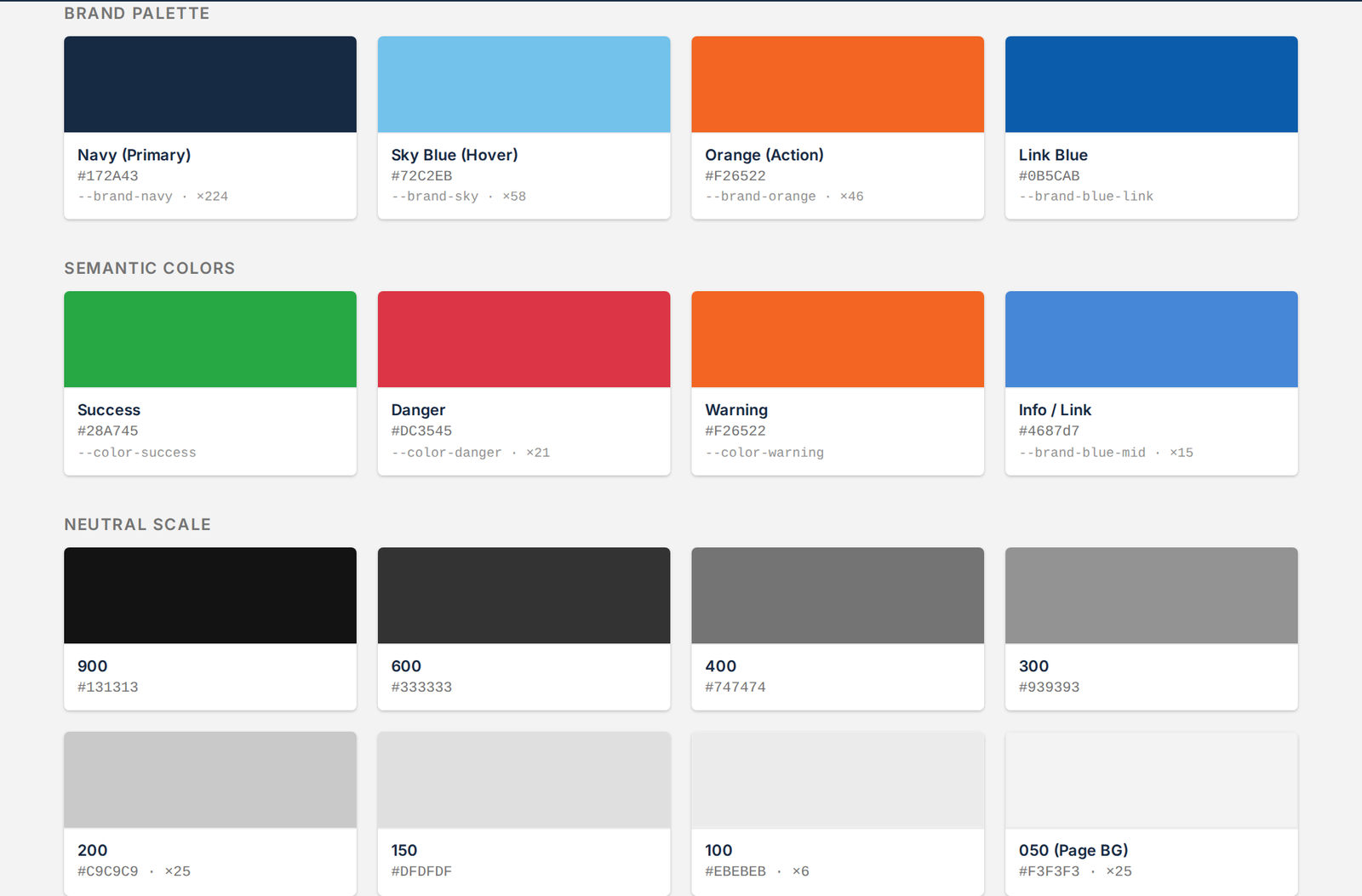
Brand and semantic color tokens with hex values and CSS variable names, plus a neutral scale.
Color tokens · Brand · Semantic · Neutral scale

Every token is a contract. Brand palette, semantic colours (success / danger / warning / info), and a neutral scale — each surfaced with the CSS variable name and production usage frequency, so designers and engineers always reached for the same value.
04 · The component layer

Every variant, every state — accessible from day one.

Each component shipped with its full matrix of variants and states. Focus rings, disabled states, and semantic colour were defined alongside the default — not added after the design review.

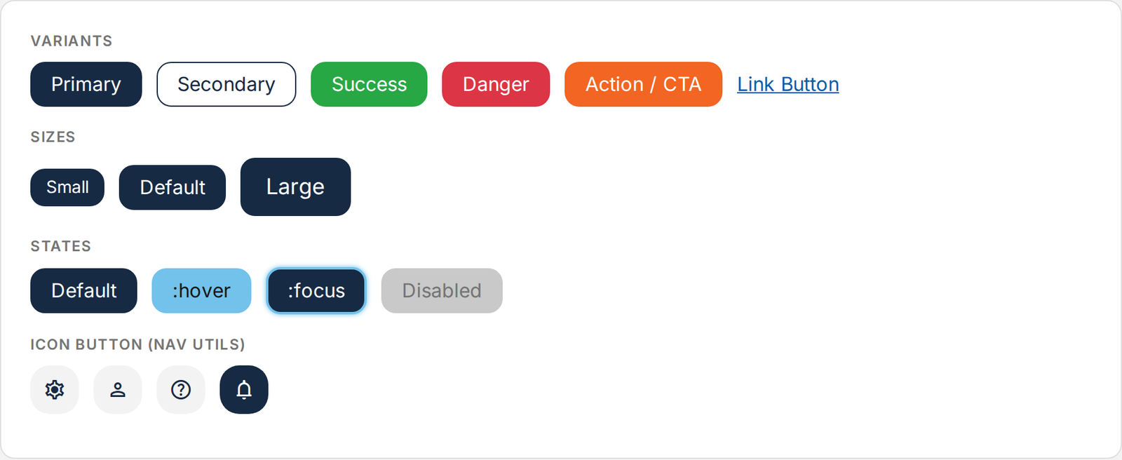
Button variants, sizes, states, and icon-button variants.
Buttons · Variants · Sizes · States

One button, fully specified. Primary / Secondary / Success / Danger / Action / Link variants, three sizes, the full state matrix including :hover, :focus, and :disabled, plus an icon-button utility for nav and toolbar surfaces.

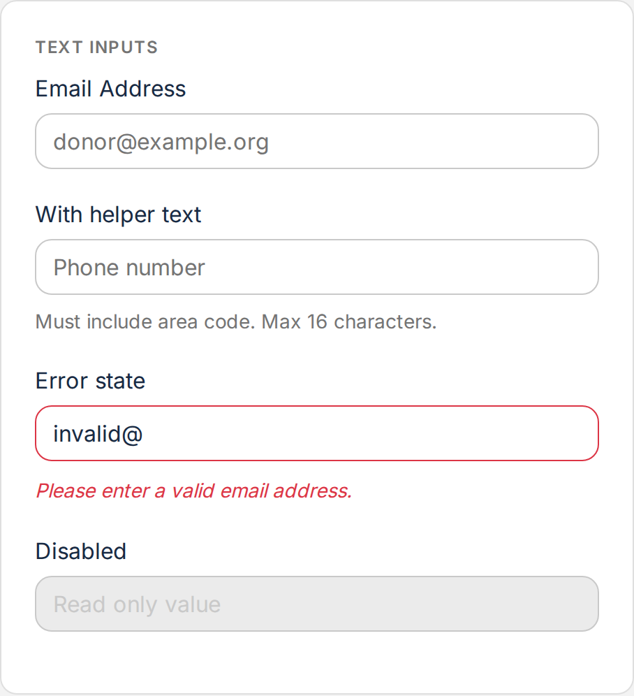
Form input states — default, focus, error, and disabled.
Form elements · States

Accessible form input by default. Every input ships with default, focus, error, and disabled states, paired with helper and error text patterns — the same set used across every form in the platform.

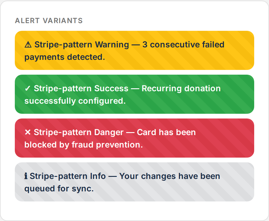
Alert and badge variants for status messaging.
Alerts & badges · Semantic

One status vocabulary. Inline alerts and badges share the semantic colour system, so success, warning, danger, and info read the same way on every surface across the platform.

05 · Governance & adoption

How adoption was earned, not mandated.

A design system is only as real as its adoption. The hardest — and most rewarding — part of the work was the cross-functional leadership that turned six independent teams into one design language.

Embedded with each team's lead during the first integration.

Pair-designed and pair-coded the first feature each team built on the system. The system landed because designers and engineers had a partner, not a mandate.

Storybook + design tokens as the single source of truth.

Figma libraries, Storybook documentation, and production code stayed in sync — so a question about a component had one answer, not three.

Weekly design critique that included engineers.

Critique was open across teams and disciplines. New patterns proposed once were reviewed, refined, and either promoted into the system or deferred — with a documented rationale.

Deprecation cadence with migration guides.

Patterns weren't removed — they were deprecated on a published schedule with a side-by-side migration path, so adoption never broke a team's roadmap.

WCAG 2.2 AA built into components, not bolted on.

Focus management, contrast ratios, and keyboard support were specified at the component level and verified by automated a11y testing in CI/CD — accessibility became free for every team that adopted the system.

An open contribution path.

Any designer or engineer could propose a new pattern or improvement. A lightweight review kept quality high; a published process kept ownership shared.

06 · Outcomes

The system landed — and the numbers held up.

A design system pays back not in the artefacts it produces, but in the speed and consistency it enables across the org.

40%
Faster design-to-development handoff
6
Product teams aligned on one system
WCAG
2.2 AA accessibility baked into components
1→4
Designers grown on the team it enabled
07 · What I'd do differently

The honest retro.

Owning a system at this scale is a long arc; here's what I'd change next time.

Co-own with an engineering lead from week one. Governance is dramatically easier when ownership is shared with engineering from the foundation, not retrofitted at adoption time. Joint authorship of the token spec is the cheapest way to earn that.

Invest in office hours and async support before the first deprecation. Adoption hinges on confidence as much as documentation. A standing forum where teams can ask "is this the right pattern?" prevents drift more than any contribution guide.

Track adoption metrics from day one. Usage data — components imported, tokens hit, custom CSS shrinking — is the strongest argument for continued investment in the system. It also makes prioritisation honest.

Let's talk

If you're building or scaling a design org, I'd love to talk.

Open to UX Manager, Principal, and Design Leadership roles — remote-first, open to relocation, overlap hours for US & UK teams.